The last time I paid attention to pink as a trendsetting color was back in 2019. The Fashion Institute of Technology in New York had set up an exhibit called Pink: The History of a Punk, Pretty, Powerful Color that was generating a lot of buzz at the time. We all took notice for a while, and then (as trends go) we moved on to newer things.
And then this summer, in rolled Barbie.
I have to admit that I didn’t see this one coming — many were surprised by the impact Barbie has had on our cultural conversations and our awareness of color. With Margot Robbie gracing the cover of Vogue in full pink and her record-breaking movie edging ever closer to $1.5 billion at the box office, Barbie turned out to be the biggest film of the year. It doesn’t hurt that the movie itself is delightful summery fun, but there’s also something to be said for how it enthusiastically embraces its signature color.
Back in 2019 I referred to Michael Pastoreau’s book Red: The History of a Color, and how he sees color in general is relevant to the “pink wave” we saw on our social feeds this summer. “Color is a cultural construct,” says Pastoreau. “It is society that gives color its meaning.”
This summer, pink was the bold and celebratory color that gave us a spark of joy and magic that we needed. It wasn’t just in the movie — it brought audiences back to theatres wearing pink clothes, sporting bright pink bags and wearing pink sunglasses. Pink became the color of the summer just as “I’m Just Ken” soared its way onto Billboard charts as the summer’s surprise hit song.
Maybe I should have seen Barbie’s success coming, because the way it incorporates color is one of the clearest expressions of how important big, bold color has become for us in everything we do. Taylor Swift, setting records of her own this summer, also used color to express the look of her 10 different albums on the recent Eras tour.
All these uses of color align with what design consultancy Wunderman-Thompson calls the joyconomy: “a movement of brand and consumer enthusiasm for elevated expressionism, positivity, and forward-thinking advancements across industries.” One way that expressionism and positivity take shape is through finding both relief and joy in the use of vibrant colors.
 I like to say that “color is for every body” — color is naturally inclusive and accepting of everyone, as well as adaptable to just about any mood or style preference. The trend isn’t necessarily focused on a particular shade or color palette, it’s the understanding the colors people choose to surround themselves with provide insight into who they are, what they want to say and how they experience the world.
How we use color should be a chromatic feast for the eyes that feeds our spirit, but it’s also very personal. Not everyone will respond to the same colors the same way. Let’s take a look at a couple different approaches to color and the effect it can have: bold and playful, or muted and meditative.
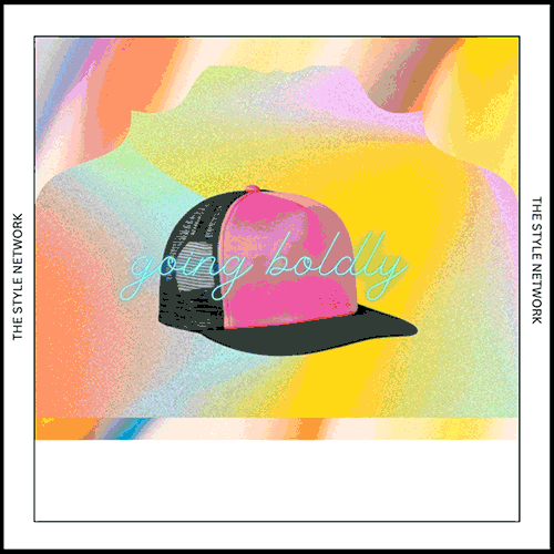
Going Boldly
If I mention “bold colors” and you’re already thinking about the brights in Barbie then you’re on the right track. We can also look to nature for the rich color palette it offers up every year. “We open the door to a magical sensorial world of sweet strawberry reds, fresh pine greens and warm sun yellows.” Or you can take a trip around the world to Morocco for inspiration in the vibrant colors of the riads in the medina, the “red city” of Marrakech.
Adding brights like this to our wardrobe brings vibrant joy with us no matter where we go. From baseball caps in Barbiecore pink to a bright red tri-blend tee to a quilted jacket in brilliant blue, these are colors that celebrate the joy we find all around us and in each other. Wearing them, either as a centerpiece of your outfit or just as a subtle pop, feels like a little party you take with you everywhere.

Calming Color
The other side of the color spectrum shows itself through soft, dreamy pastels that communicate visual minimalism and ease. These colors can be found everywhere, including SanMar’s recently-launched Holiday Gift Giving Guide. The guide’s theme, “Find Joy,” demonstrates how a subtle, muted color palette has the automatic effect of making you feel right at home.
Finding examples of these colors in clothing is just as easy. The gentle sage green of a Perfect Blend long-sleeve tee, the genderful lavender in a Heritage fleece pullover hoodie from New Era® and even the subtle off-white tone of a mountain beanie from The North Face® are all expressions of color that can become a source of centered calm for the wearer and everyone around them.
When you’re developing a color palette for a project, keep the joyconomy in mind and remember that both joyful and gentle colors are important. Color is an expression of emotion, style and personality. Your mission, should you choose to accept it, is to gather different options together in a chromatic feast that everyone can revel in wearing.
Next month we’ll be exploring new perspectives in what we used to call a uniform. Spolier alert: uniforming ain’t what it used to be. Until then…have fun, be playful and let your colors shine.