With the arrival of Spring, I can’t help but think about colors. The bright green of a new leaf, the subtle pink of a cherry blossom, the brilliant blue of the morning sky – you just can’t get away from it (and why would you want to?).
When I envision Newtopia, I see it as a colorful place. Color is how we connect to the clothes we wear and how we express ourselves. In a place where we’re making fresh new choices and building smart, versatile wardrobes, color is one of the most obvious ways that those expressions come to life.
 The colors we wear have an undeniable effect on our mood, as we saw recently when we spent some quality time with green. Let’s take a broader look at some of the ways colors are being used now.
Color Choice as Investment
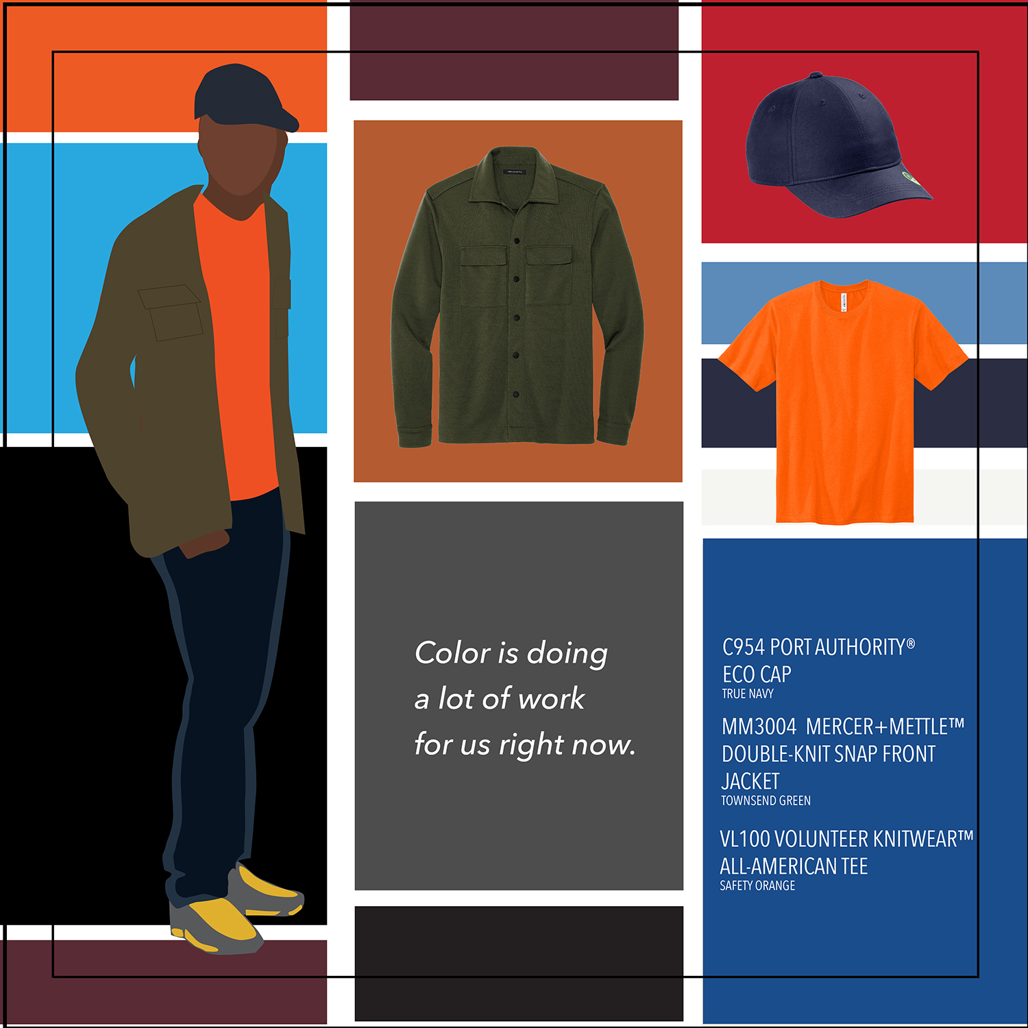
It’s important to remember that color is doing a lot of work for us right now. Risk-averse customers are looking for longevity and versatility in a world that can still feel uncertain sometimes, even as we approach the end of pandemic restrictions. Tight supply chains mean that we all want something we can rely on for a long time to come.
 The safest investments when it comes to color are the minimal, classic choices we’re all familiar with. Black and neutral colors are pretty much always in, and that’s especially so now. But we’re also in a space where taking risks with new colors is something a lot of customers are looking forward to exploring.
Monochromatic Mood-Setters
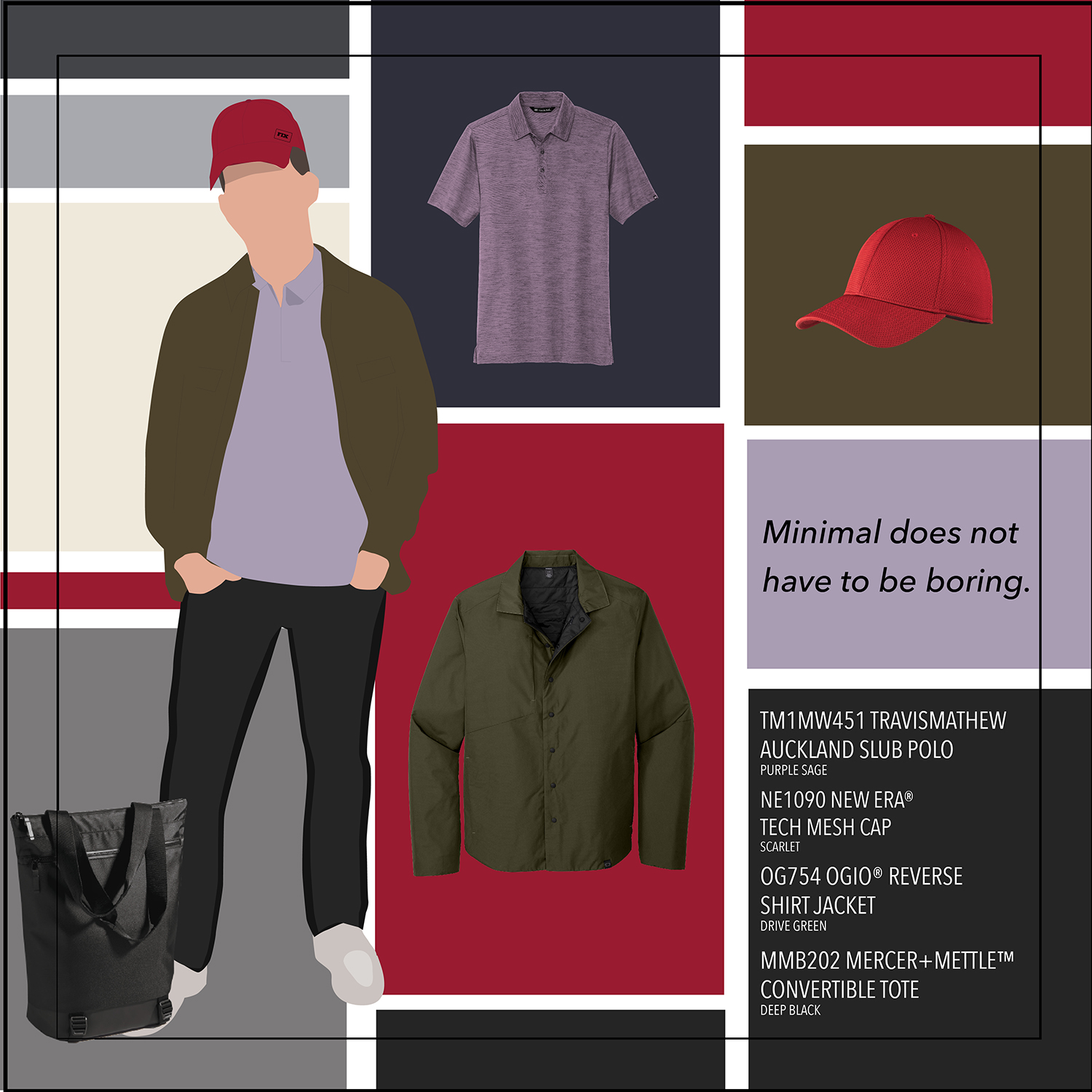
I’ve said it before, but it’s worth pointing out again: Minimal does not have to be boring. This applies to color as much as it does to style. Monochrome dressing has a timeless appeal, accentuated by textures and unique details while keeping outfits adaptable and easy. This can look different depending on the effect you want to create.
When you need to center yourself and project calmness, neutrals are a safe, stable bet. The minimal, uniform colors in the Mercer+Mettle collection are a good example of using neutrals to create a calming effect for yourself and those around you.
Busting Out the Brights
When you see the word “monochrome” you might automatically think outfits all in black or grey. Fashion designers are taking a different approach, striking a “perfect balance between understated silhouettes and exciting color to make monochrome feel modern, polished and effortless.” Pantone set the tone for the year when they invented a new, bright shade of Periwinkle.
This shows up in our clothing choices when instead of calming neutrals you get powerful bursts of green or yellow, and pink is making strong showings in everything from cars to gaming merch – pink is everywhere! Monochromatic ensembles are exploring these colors fearlessly from foundational pieces to outerwear and accessories, and the overall effect is simply striking.
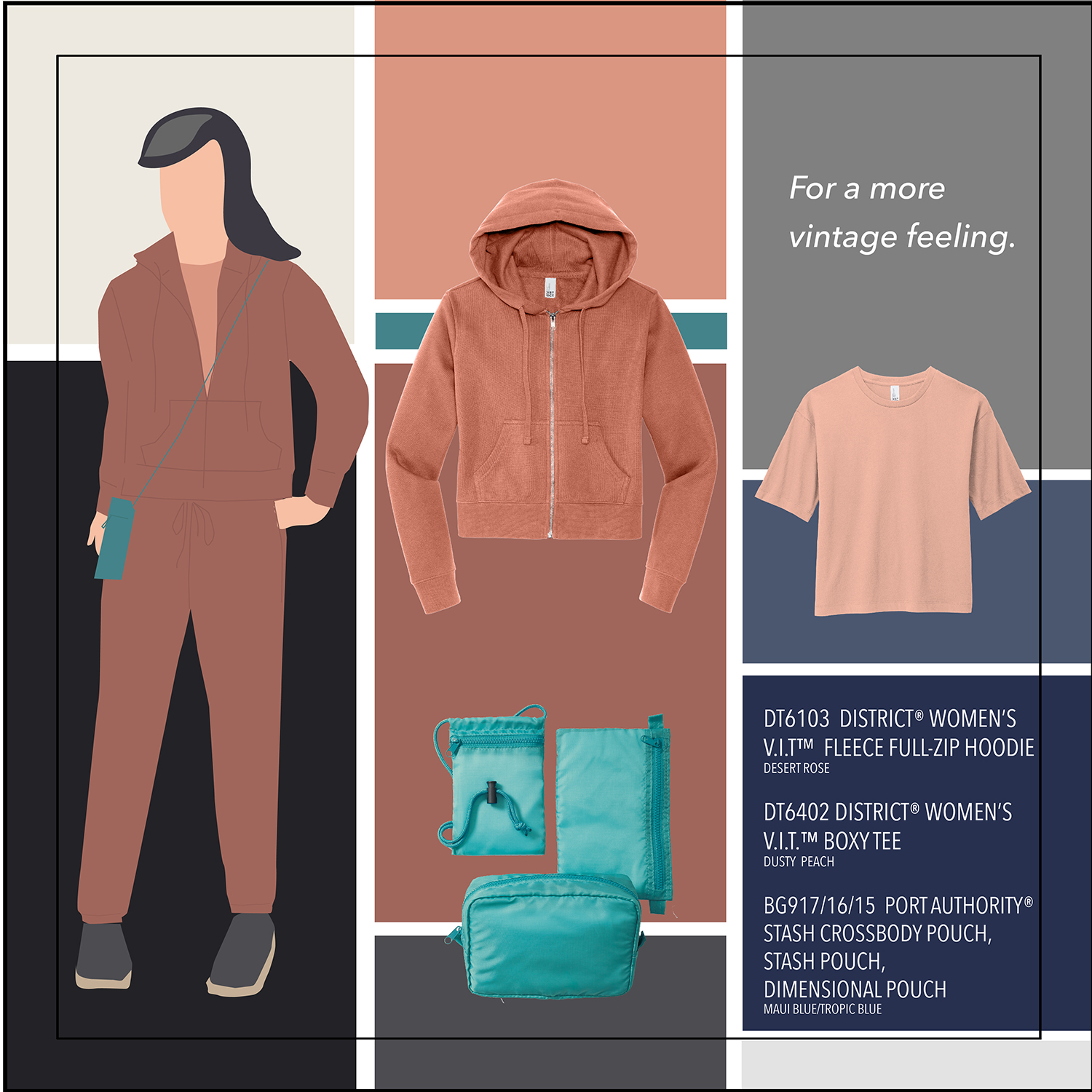
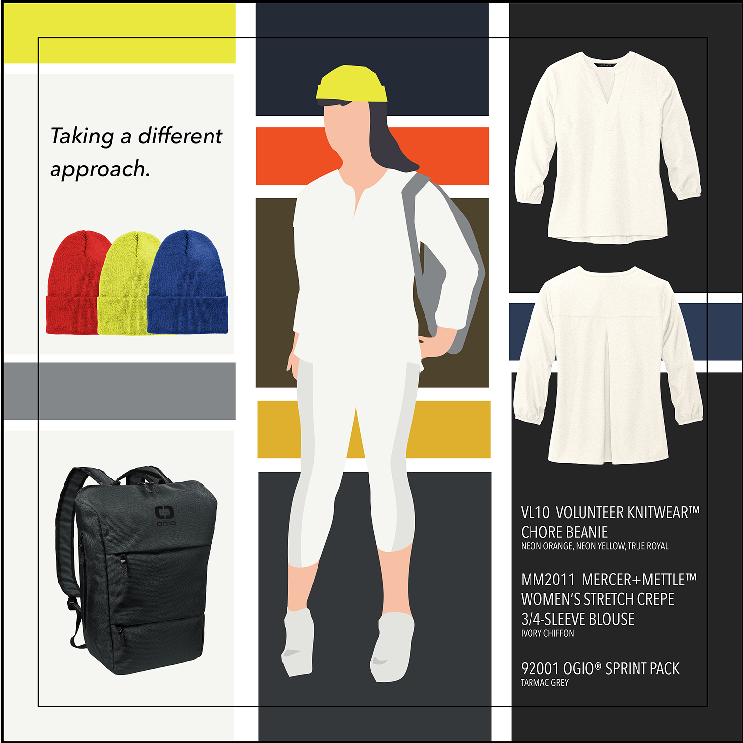
Playing with Pastels
For a more vintage feeling, focused on wellness and an Earth-friendly outlook, pastels offer the same ease and versatility with a more playful feeling. “Their ability to go with just about anything allows you to add vibrancy to your outfit without having to worry about going over the top.”
How you use these colors is where your creativity comes in — you can see a head-to-toe monochrome outfit in Desert Rose and it works beautifully. Or you can mix it up and bring pops of color and neutrals together in one outfit.
All Together Now
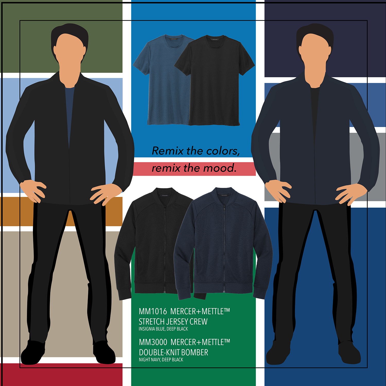 One of the takeaways when we talked about smart wardrobes was that easy and dressy can co-exist comfortably. The same philosophy can also apply to our use of color – quiet and loud can come together in the same outfit for a nuanced, multilayered expression. The range of colors you choose can provide a foundation of versatility and practicality while also adding bright hints of reassurance and a much-needed uplift.
This is where you can really play with those mix-and-match skills we’ve been talking about. Try a dominant neutral and add a splash of something bright – a dark grey cardigan over a brilliant blue top, for example – to brighten up the combination. Or see how you feel about the opposite — let a pastel blue woven take center stage, grounded by a charcoal grey tee underneath. You’ll find that every time you remix the colors, you’re remixing the mood and feeling of the outfit.
As we approach the end of the pandemic, our world is ready for a revival of travel, optimism and creativity. Creating connections to the colors we choose to wear is one way we can express this positive outlook – and as you can see, how it comes together is entirely up to you.
I hope you’ll join me next time as we bring our exploration of Newtopia to a conclusion, taking a step back and seeing how all these pieces connect, and how it leads to our next major trend. See you then!